

Introduction to flexbox
Writing CSS alignments and positions have now become easier with Flex and Flex properties. Let's dive deep into these properties and try to understand and master Flexbox.
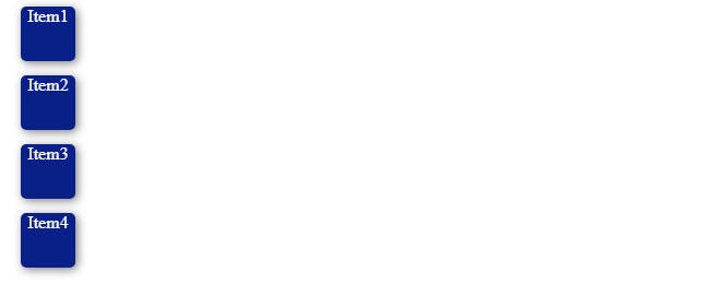
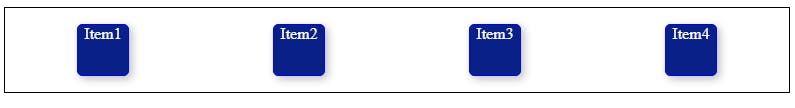
Now we will Learn this flexbox using an example. We have four boxes Item1 , Item2 and so on . From the code snippet we can see, the items are aligned vertically, by default, and the default display is block-level.
Flex Display
First of all let's understand that the Flexbox works on the parent class, not on the child classes. To start using all the flex properties we need to first give display: flex; to the parent container. Now lets see what happens if we give display as flex.
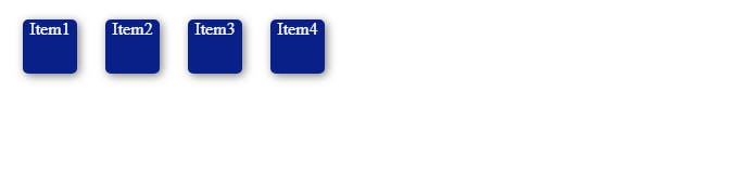
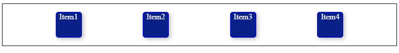
After giving display property as flex the items got placed in horizontal position as the default flex-direction of flexbox is a row.
Properties for Parent components(flex container)
1. Flex-Direction
Flex-direction determines in which direction are the child components placed inside the parent container.
Syntax:
flex-direction: attribute Value;
Attribute values:
row : Items are placed in a hrizontal position By default its value is row.
column: Items are placed in a vertical position.
row reverse: items are placed horizontally in a row but in a reverse order.
column reverse: items are placed vertically in a column but in a reverse order.
2.Flex Wrap
It specifies if we have multiple lines then the lines get wrapped. In simple words it means to bind everything. It is similar to word wrap which is used in Vscode.
Syntax:
flex-wrap: attribute value
Attribute value:
no-wrap: The flex items will be laid out in a single line without wrapping.This is the default attribute value.
wrap: The items gets wrapped if having multiple lines.
wrap-reverse: It works same as wrap but the items are placed in reverse order.
3.Justify Content
justify content works horizontally in this the items are positioned along a horizontal line.
Syntax:
justify-content:attribute value;
Attribute values:
flex-start: The items get lined up at the start of the line. This is the default attribute value.
flex-end: The items are placed at the end of the container.
center: The items are lined up at the center of the main block.
now the next three attribute values are a bit tricky ones So i will explain them with simple examples
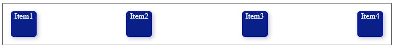
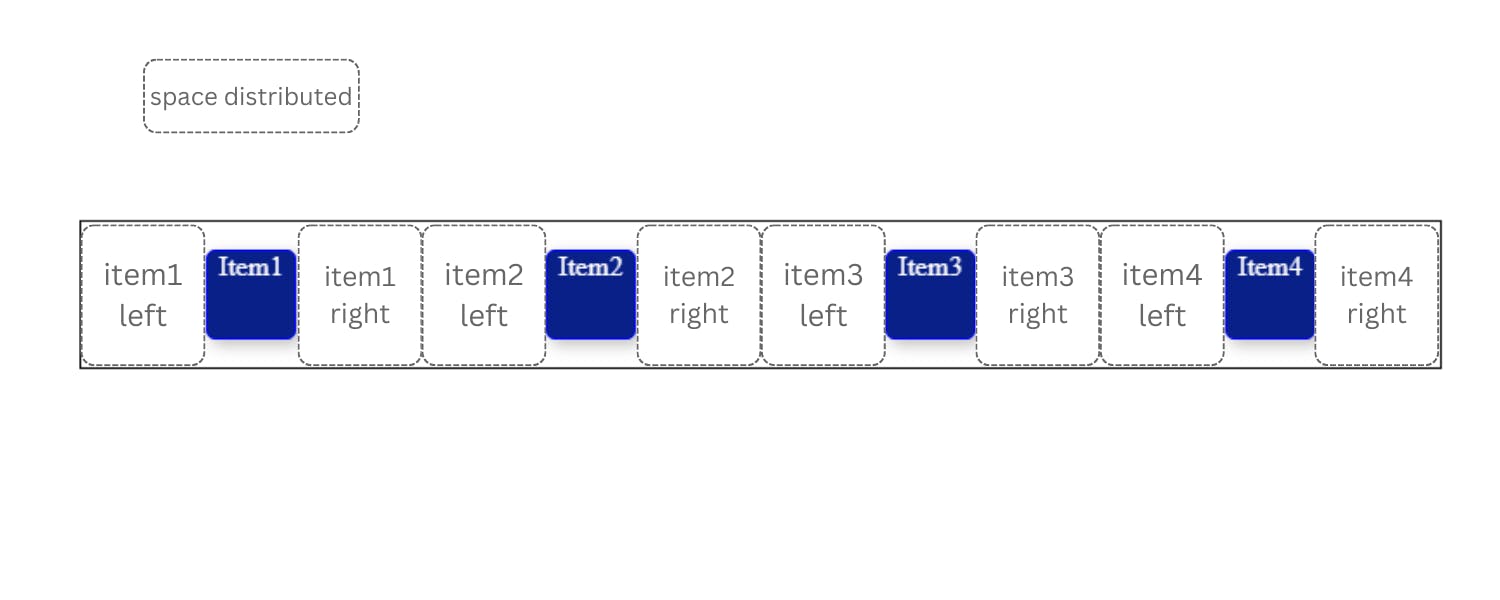
space-between: items are positioned like the first item will be at the start line and the last item will be at the end line and other items are distributed with equal space in between of the container.
space-around: The items are positioned evenly but here the only turnabout is that every item shares equal space from both the sides left and right.
space-evenly: The items are positioned such as there should be equal space between any two adjacent items and there should also be equal space at the before the first and after the last item.
4.Align items
This Property is very similar to justify-content but here instead of items getting horizontally positioned align items positions the items vertically.
Syntax:
align-items: attribute value;
Attribute Values:
stretch: This is the default value and it stretches the items to fill the container.
flex-start: This positions the items at the top of the document.
flex-end: This positions the items at the end of the document.
center: This positions the items at center of the document.
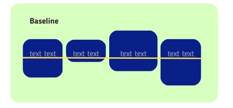
baseline: It gets aligned according to its baseline.
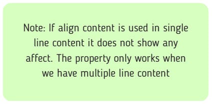
5.Align Content
When you have to position multiple lines of content we use align content. It is very similar to
justify-content.It even has same attribute values like justify content.
Attribute value:
Flex-start: The items are positioned at teh top of the document.
flex-end: The items are positioned at the end of the document.
center: The items are placed at the center of the document.
stretch: The items are stretched to fit inside the container.
space-between: The items are spaced evenly and the first item is placed at the very start and the last item is placed at the very end of the container.
space-around: The items are positioned evenly but here the only turnabout is that every item shares equal space from both the sides left and right. For more understanding do checkout the above example in justify content's attribute value space-around.
6.Gap
It controls space between items.
eg : gap:23px; this creates a gap or space of 23px.It doesn't happen on outer edges but only happens between items.
Properties for child(flex-items)
1. Align Self
It defines how an individual element or item could be flexed or positioned.
Syntax:
align-self: attribute value
Attribute Values:
flex-start: The items are positioned at the start of the container.
flex-end: The items are positioned at the end of the container.
center: The items are positioned at the center of the container.
stretch: The items are stretched to fit inside the container.
2. Flex Grow and shrink
flex-grow has the ability to increase the flex item's size. flex-shrink has the ability for a flex item to shrink . They don't take negative values.
3. Order
By default, flex items are laid out in the source order. However, the order property controls the order in which they appear in the main container.
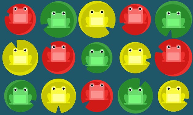
Flexbox froggy
You can practice your flexbox properties by playing this fun game and improve your css.
Conclusion:
We learned about the parent containers and the child flex items .We have learned how to successfully build our flexible layouts by using flex properties and flex attribute values.Hey now you can finally Flex your flexbox skills .